Guiding the first investment, not explaining it
Conversion to a first investment more than doubled.

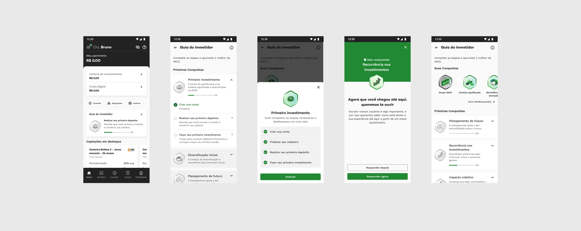
The Investor Guide, live on the INCO app — the guided journey in the hand.
First investment within a month of signup
A first step most people never took
INCO is Brazil’s largest collective-investment platform — CRI, CRA and real-estate funds — with 500k+ users and app ratings of 4.8 on Google Play and 4.9 on the App Store. I’ve designed there since 2021, shipping dozens of result-focused solutions across the app.
The quarter called for more engagement from the existing base, and the funnel was blunt about where it broke: only about 8% of signups became investors, and fewer than half of those made a second investment. We had just shut down the old loyalty program — a bonus scheme for the most engaged users, whose cost-benefit didn’t hold — and that left a sharper question in its place: if we’re not going to pay for engagement, how do we awaken it from within?
The easy read was “people don’t understand how to use the platform,” and the easy fixes were the obvious two: explain more, or hand out more bonuses. This case is about why both were wrong.
The gap was real — but explaining would miss it
That bet on intrinsic motivation became the “Objectives & Motivations” discovery. To avoid designing in the dark, I triangulated four sources — benchmarking, desk research, business and product data, and 19 interviews across very different investor profiles — then closed with a lean-inception and design-sprint workshop, where the concept came out aligned across the group.
- 19
- In-depth interviews with beginner and confident investors
- 4
- Sources triangulated — interviews, desk research, benchmarking, product data
Increase the share of monthly recurring active investors.
How might we spark a sense of progress for the “confident” and “beginner” investor — meeting their need for achievement — and so speed up the loyalty cycle with INCO?
The central insight changed the project’s direction. INCO isn’t where someone keeps their life goals — it composes larger ones. The goals that make sense inside the platform are about using and performing on it, and the real value was never one investment; it was building a diversified portfolio within a strategy.
So yes, the gap was about understanding — but closing it by explaining would miss the pain. It made far more sense to guide people’s actions at the level the platform actually operates.
People didn’t need another explanation. They needed to be guided through the first move.
The reframe that set the direction
Two profiles sat at the center of the work — and later became the guide’s two modes:
The Beginner
Conservative, little knowledge, capital just starting out. Wants safety before risk, decides on intuition and tips, values access and simplicity.
The Confident
Moderate-to-bold, medium knowledge, real risk appetite. Wants to grow wealth in the short-to-medium term, diversifies for opportunities, values making money and belonging.
From that framing, a workshop moved the idea from loose opportunities to a testable solution.
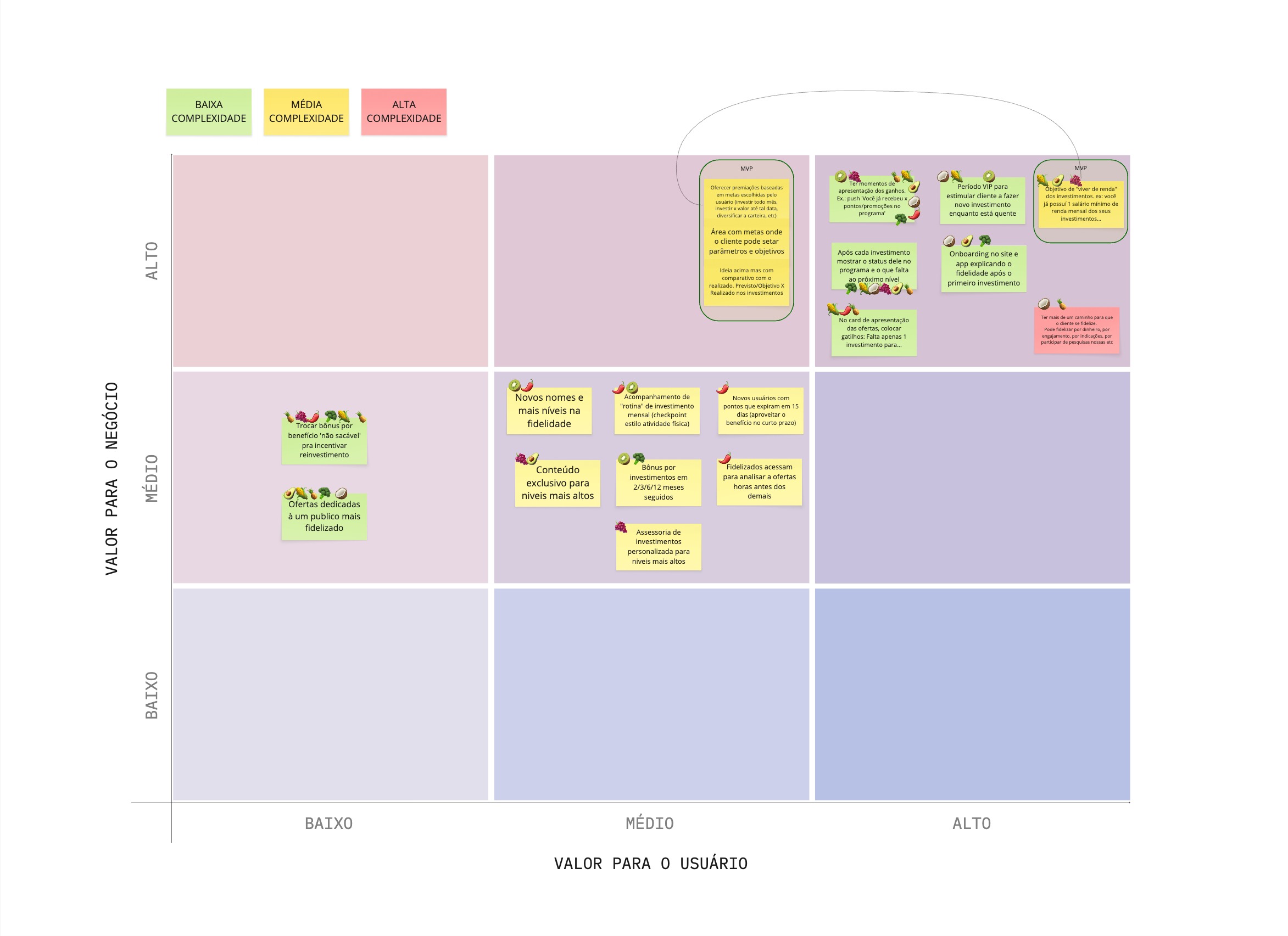
Every idea for the focus challenge, plotted by value to the user against value to the business — complexity flagged, and the MVP circled.
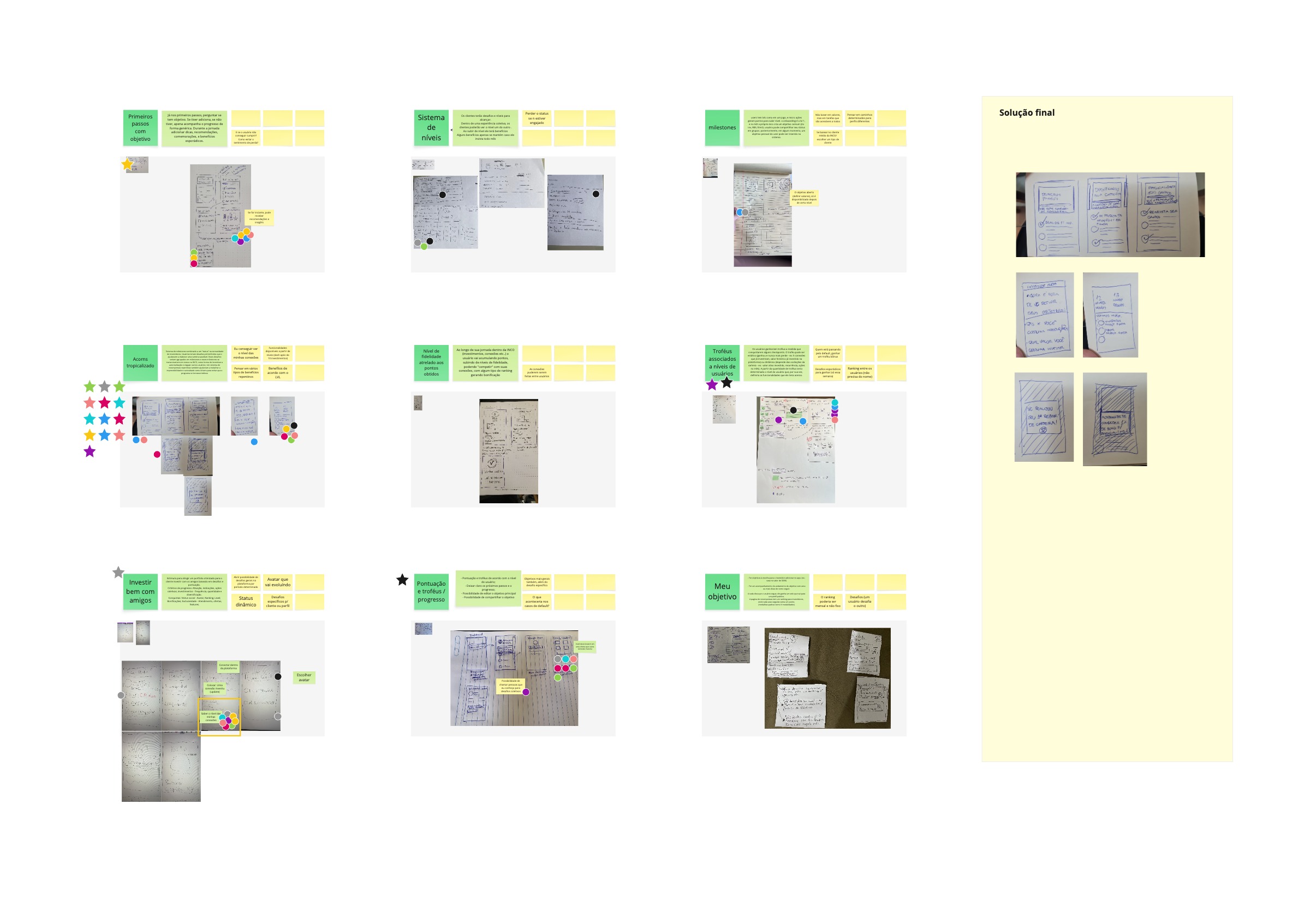
A workshop where everyone sketched ideas against the challenge — then, together, we chose one solution to take into experimentation.
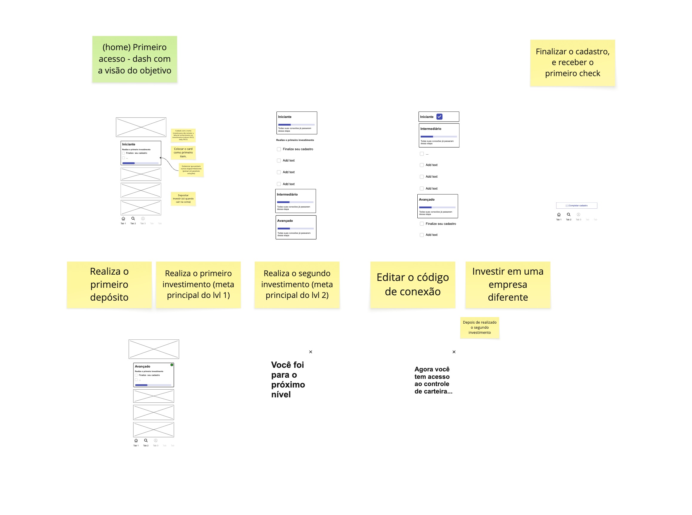
Refining the chosen solution into a storyboard — the workshop’s final output, and the base for the quick prototype I took into usability testing.
A guide, not a lesson
Instead of teaching people about collective investment, we chose to conduct their actions on the platform — friendly, and lightly gamified. Every more-obvious alternative was a version of “explain” or “reward” — a new loyalty program, a tutorial onboarding, intro walkthroughs — and each one lost on cost-benefit.
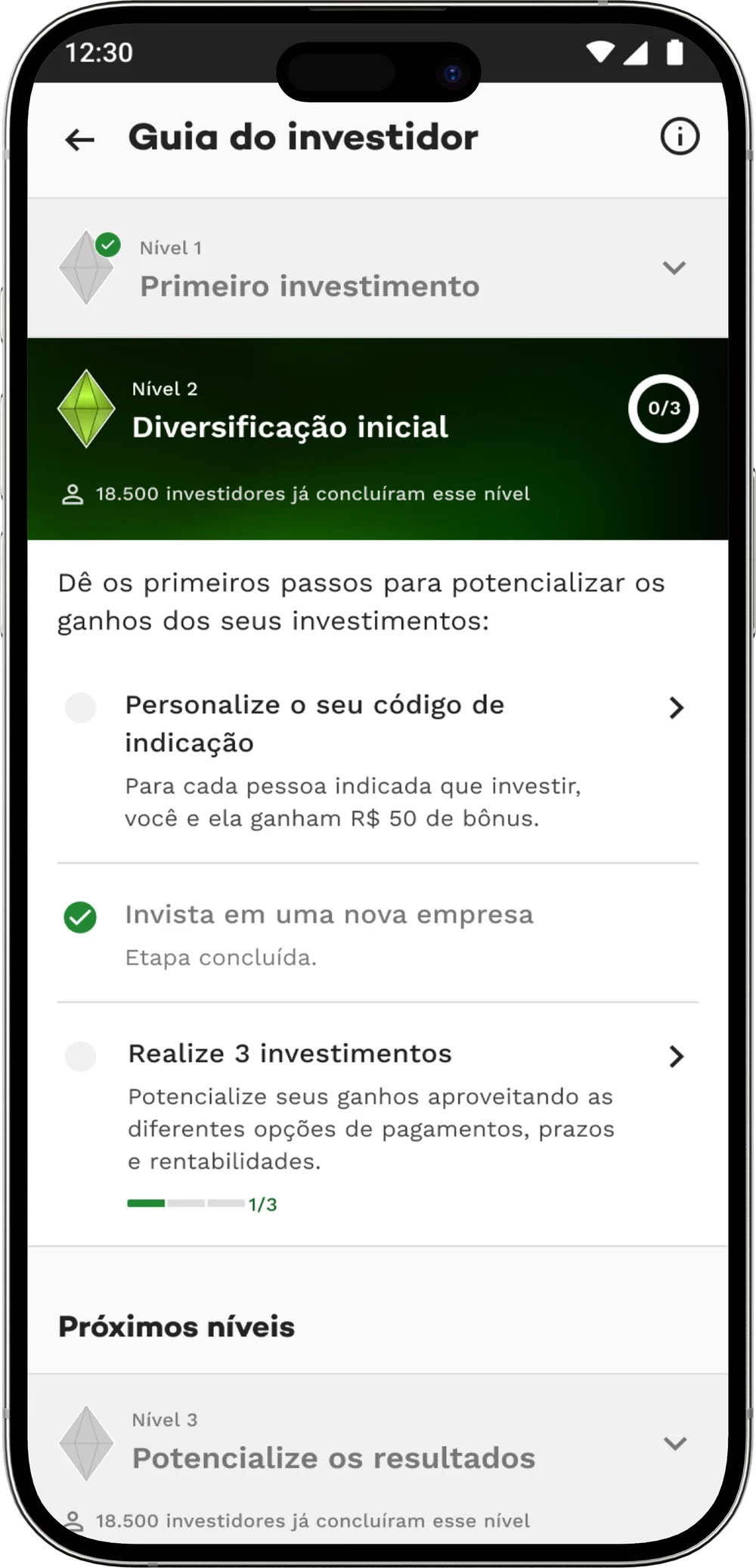
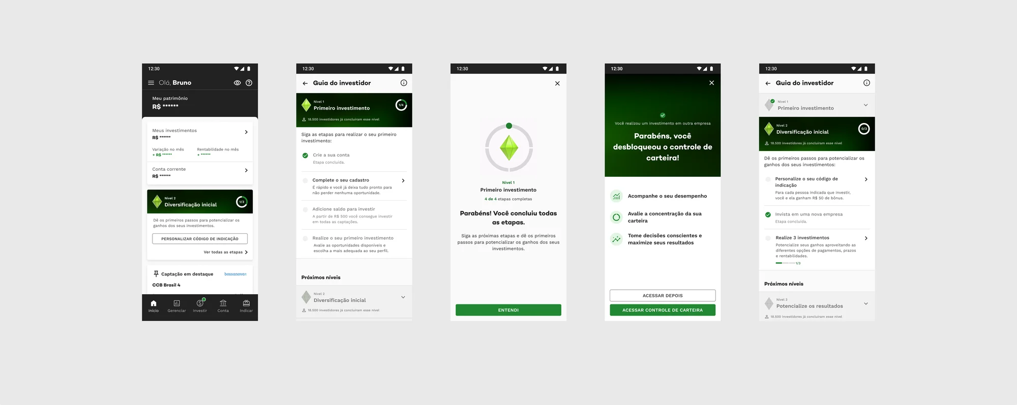
The guide organizes the experience into levels (macro steps), each gathering concrete actions on the platform (micro steps). The MVP had three:
-
Level 1 — First investment
Create account → complete registration → add balance → first investment
-
Level 2 — Initial diversification
Personalize referral code → invest in a new company → reach 3 investments
-
Level 3 — Amplify results
A future-value milestone — deliberately still empty in the MVP
Every task carries its why — “reduce specific risks by diversifying your portfolio” — teaching through action, not loose text. And the next task is always highlighted on the home. Underneath, a few deliberate behavioral levers carried it, each placed exactly where people hesitated.
-
Endowed progress
People finish what already feels begun.
The guide opens with steps already complete — you feel advancement from the very first contact.
-
Goal-gradient & Zeigarnik
Effort rises near a goal; unfinished tasks stay on the mind.
Progress rings and visible open tasks create traction to finish.
-
Prompt at the point of action
A decision made where it happens is a decision taken.
The next task sits highlighted on the home, reducing the choice to one obvious step.
-
Social proof
We read others to decide what’s normal and safe.
“18,500 investors have already completed this level,” right at the moment of doubt.
-
Progressive disclosure
Detail on demand keeps a first decision light.
Levels reveal complexity gradually; the ones ahead sit collapsed, signalling the journey continues.
The MVP, built — the version I took into usability testing:
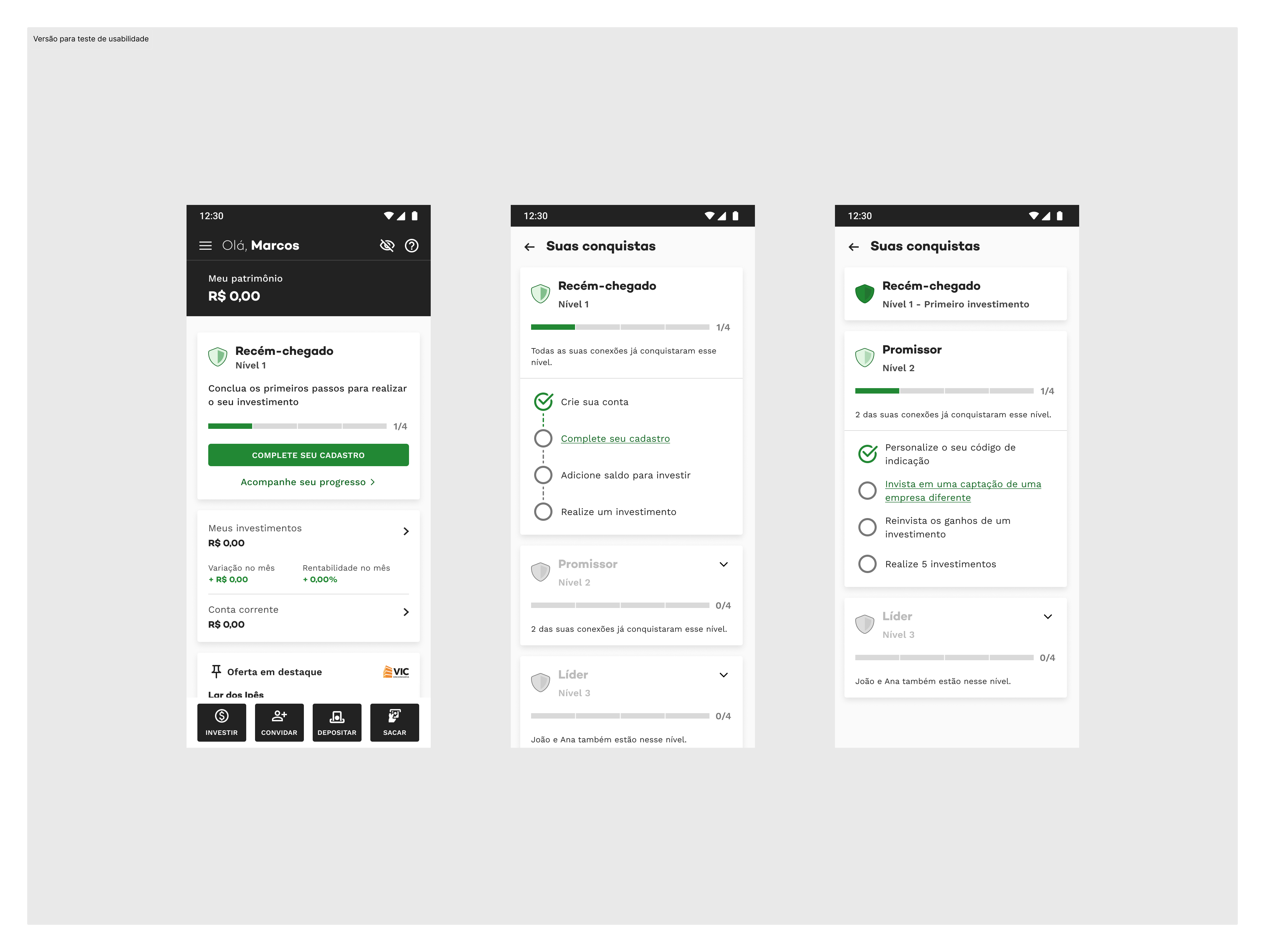
Before scaling the guide, I ran a remote usability test with five INCO investors — beginner and confident profiles.
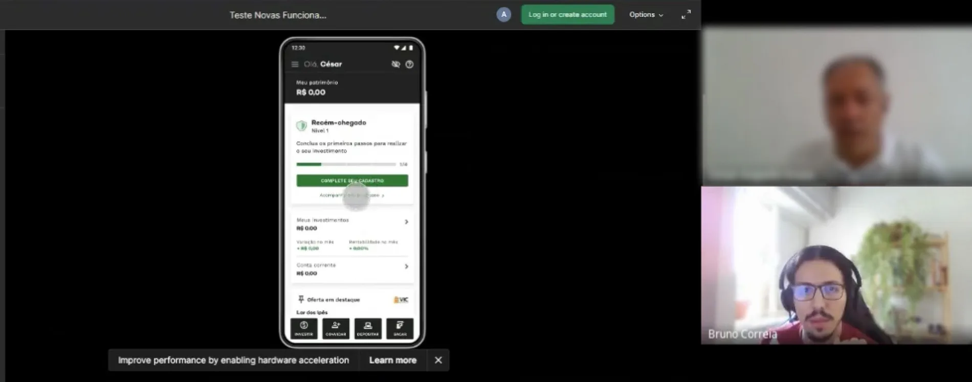
The session sharpened the MVP in three places:
-
The guide didn’t pull enough attention — so I gave the next task real prominence on the home, with a CTA.
-
Completion feedback felt faint — so I reinforced the presence of the completion micro-interactions.
-
People read “task = bonus,” a hangover from the old loyalty program — so I reworked the UX writing to move the read from “earn a bonus” to “get more out of the platform.”
With those refinements applied, the guide was ready for a controlled A/B test:
A six-month A/B test, not a hunch
The refined MVP went into a controlled A/B test on Mixpanel and Firebase. The guide was assigned at random by the team, never chosen by the user, and it ran six months with exposure ramped to de-risk — 20% of the base for two months, then 50% for four.
Two per-user measures, both anchored to each investor’s own signup date — whether they joined at the start of the test or five months in:
First investment within a month of signup
Still investing six months after signup
- 6 months
- A/B test in production
- 20 → 50%
- Exposure, ramped to de-risk
From a checklist to a system: v1 → v2
The MVP proved the underlying hypothesis: directing people changes behavior in a way that matters. So I extended the guide well past the first steps — into the high-engagement moments too: more investments, returns received, activating features, inviting others.
The most important structural decision of v2 was the shape of the journey. The first steps stay a single linear path — it protects the critical activation funnel and keeps cognitive load low for the Beginner. After that, the structure goes non-linear: the Confident investor completes tasks in parallel, in their own order — the autonomy the discovery had pointed at all along.
It also stopped being a fixed screen and became an extensible engagement system — tasks, badges and new objectives can be added without redesigning the structure. And the richer gamification quietly fixed the empty feeling of reaching the MVP’s third level.
That extensibility is why the guide is still alive. It was delivered in November 2024 and hasn’t stood still since — it runs in the app today, and I keep tuning it as the product moves.
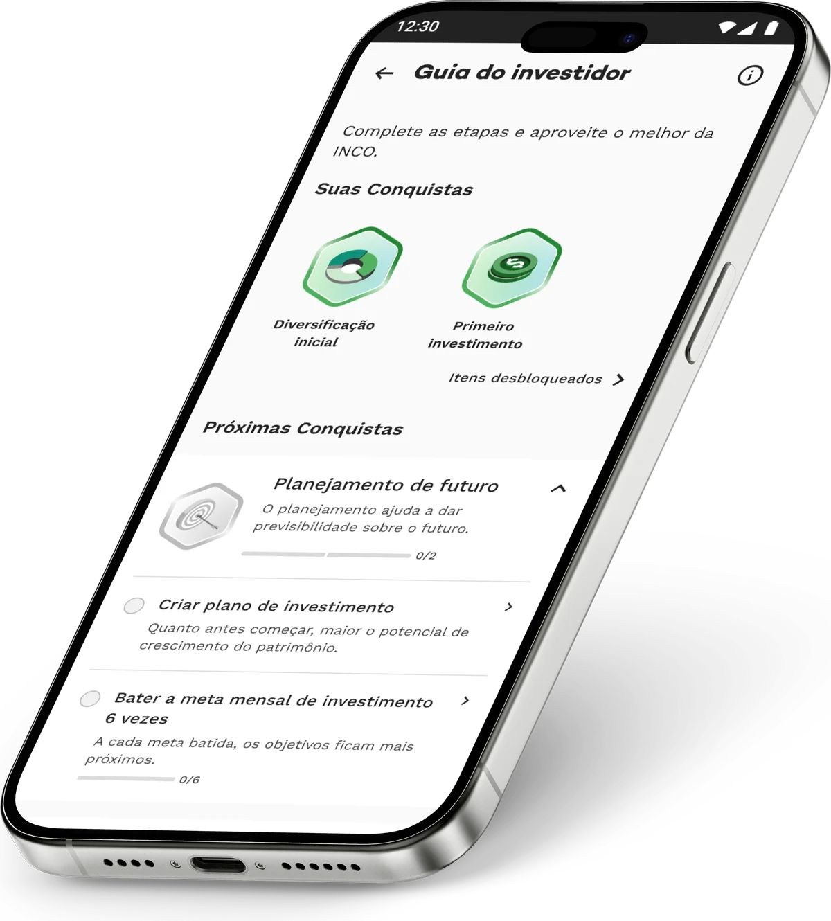
The final version turned the guide into a system you can extend. Its pieces:
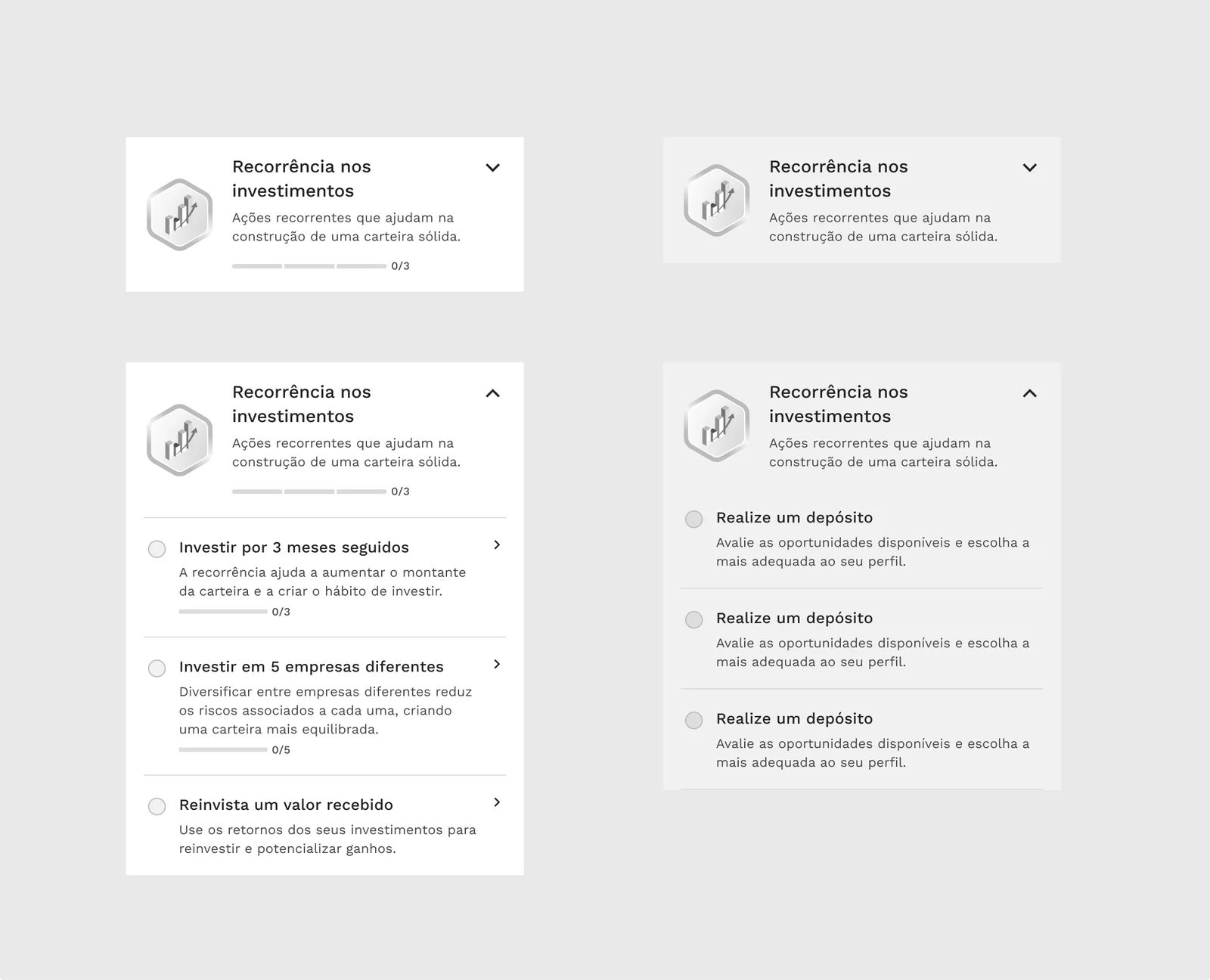
One task card, collapsed and expanded — the reusable unit the whole guide is built from.
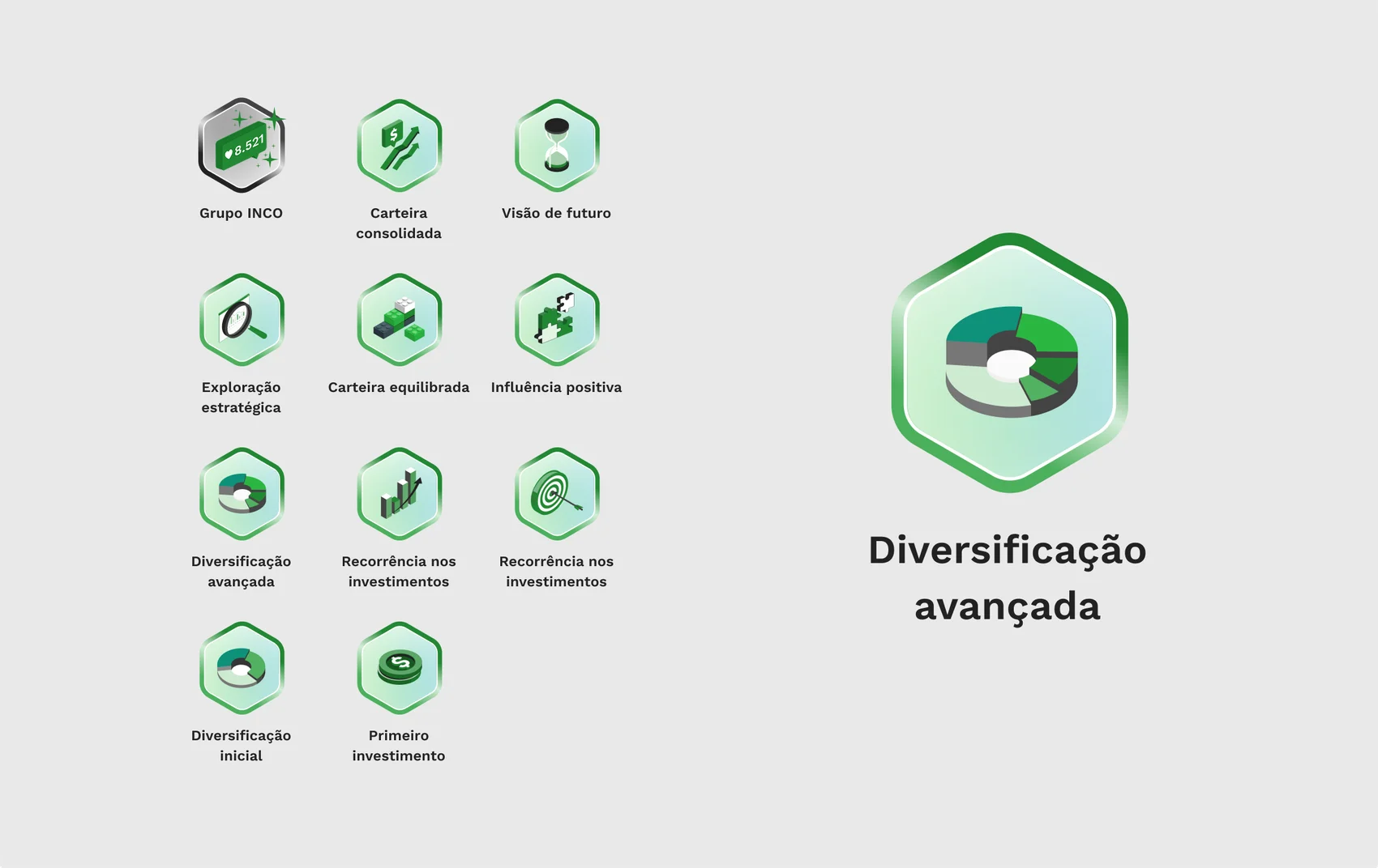
The badge library — the reward layer that expanded with v2.
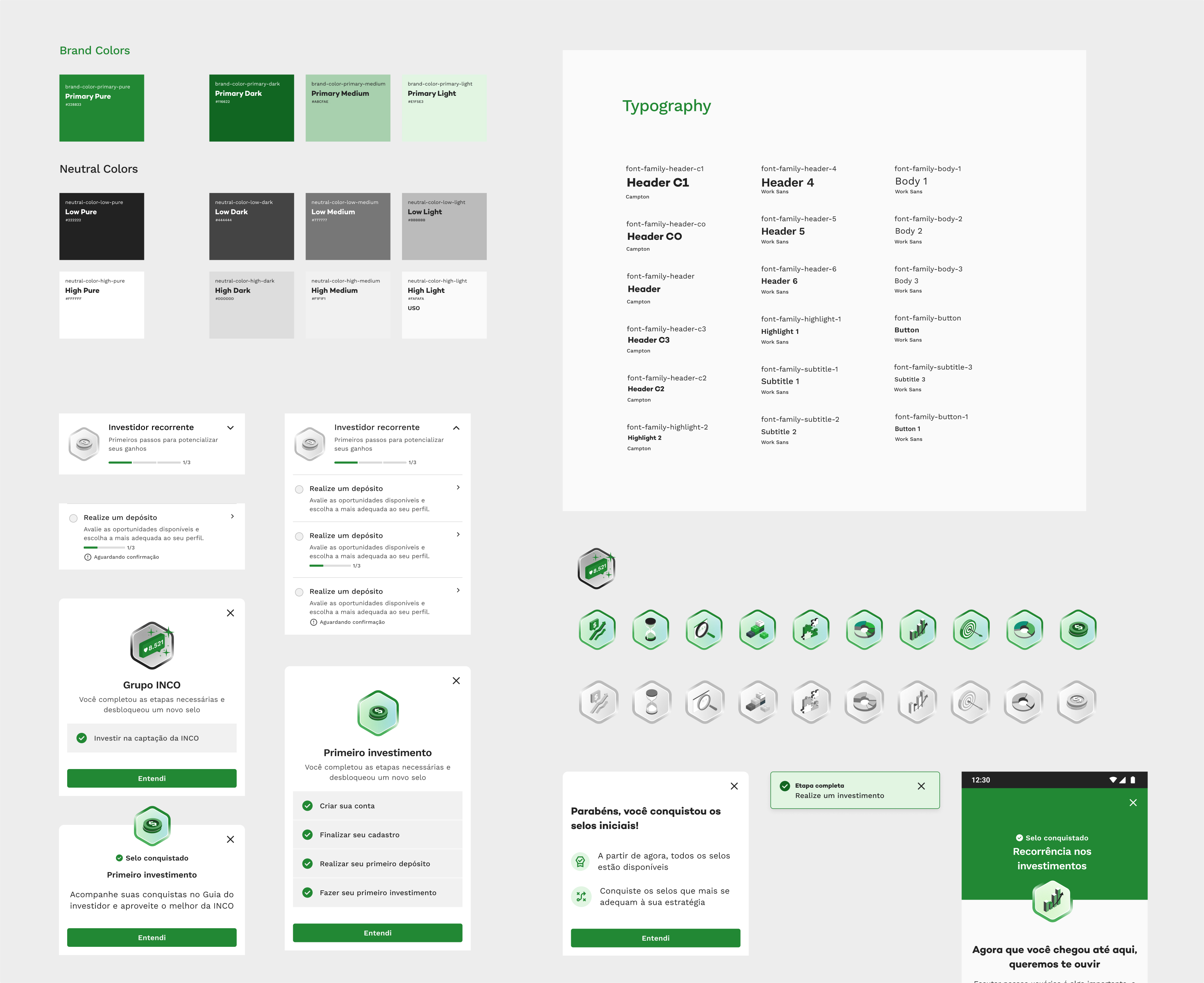
Built on INCO’s design system
The guide extended the design system I’d already built for INCO — same voice, same materials — rather than opening a parallel look. It stays friendly but sober, the INCO baseline, so the guide felt native from the moment it shipped.
The interactive layer was mostly new: task cards with collapsed and expanded states, progress rings, unlock celebrations and an in-app badge library — all built as Figma components with variants, so a change to a card variant propagated across every screen it lived in.
The badge icons started from an existing icon pack and were extended with a few AI-generated variants that respected the same base language. That badge layer — earned marks you could watch fill up — is what carried the gamification.
What I took from it
-
Question the obvious answer first. “Explain more” and “reward more” both looked right, and both solved the wrong problem.
-
Guide the actions — at the level the product actually operates, not the level of a lesson.
-
Validate before you scale. A six-month, randomized A/B test turned a strong idea into a decision I could defend.
-
Ship the honest trade-off. The MVP’s empty third level was a conscious call — send the milestone before the content — and v2 closed it.
